

RockYard Music Fest’s Visual Identity: Designed for Longevity
BRANDING | EVENTS
A clear and bold heading
Rockford’s convention and visitors bureau wanted to start a new tradition in the city — a music festival to bring fun, family-friendly games, and entertainment to the Rockford community for years to come.
Launching a tradition
GoRockford wanted to create a new annual tradition at the end of the summer, just in time to cap off Rockford’s America 250 celebration. They decided to plan a two-day music festival with activities for attendees of all ages, including live music, a drone show, games inspired by field day, an art tent for kids, a custom ice cream flavor from local favorite Dairyhäus, fireworks, and much more for the community.
Some of our team members were around for the heyday of On the Waterfront, which was once Illinois’s largest music festival, so we were honored to work on a new event that would bring music back to Rockford’s riverfront. We made it our mission to design the festival’s visual identity for longevity, anticipating that the event will continue to gain popularity year after year.
A clear and bold heading
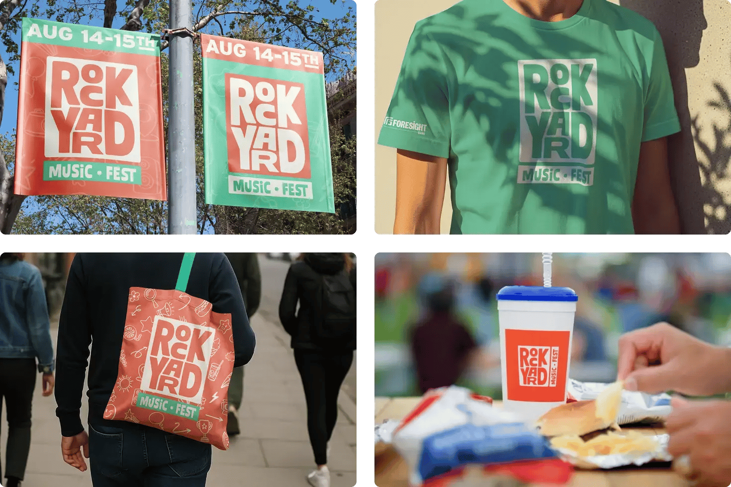
Trekk designed the friendly branding and visual identity for RockYard Music Fest, creating logos, promotional signage, and more to ensure this tradition is a fast favorite.
Local fun for years to come
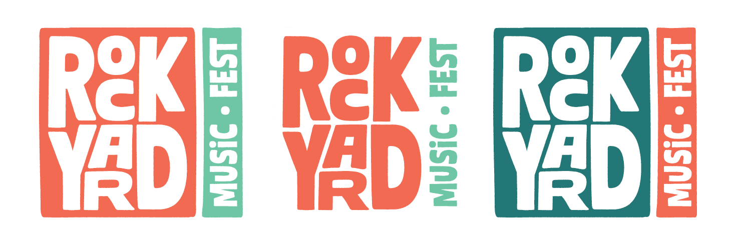
After brainstorming hundreds of names — like Forest City Festival and Rock River Days — we landed on RockYard Music Fest, an homage to the city’s name and down-to-earth feel of the festival. The next step was creating three eye-catching logo concepts, ranging from fun to music-focused. GoRockford selected a vibrant, playful logo and color palette that gives off a lighthearted summer vibe.
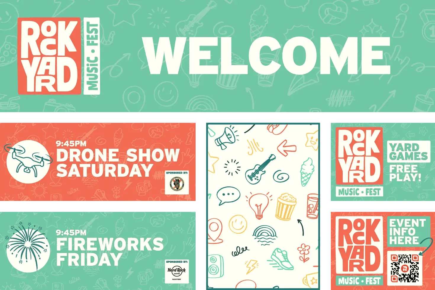
With the visual identity chosen, Trekk designed all of the signage — from promotion to the band lineup to wayfinding and bar and grill menus — for a weekend our team was thrilled to attend. Marking the debut of the revamped Davis Park, a staple space for recreation and entertainment in Rockford, this exciting event brought back community, energy, and joy right along the river.
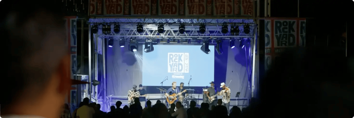
RockYard is an event we knew the community would not only love, but love for many, many years. When designing, creating something that was ageless, classic, and recognizable was the goal, and I think we accomplished that.
Mike Wilson
Trekk CCO
Produced by GoRockford